Period elements project part 9: initial 3d model + considerations
- ehague1
- Jan 13, 2023
- 3 min read
Updated: Jan 15, 2023
In this blog post, I will begin the development of my 3D model.
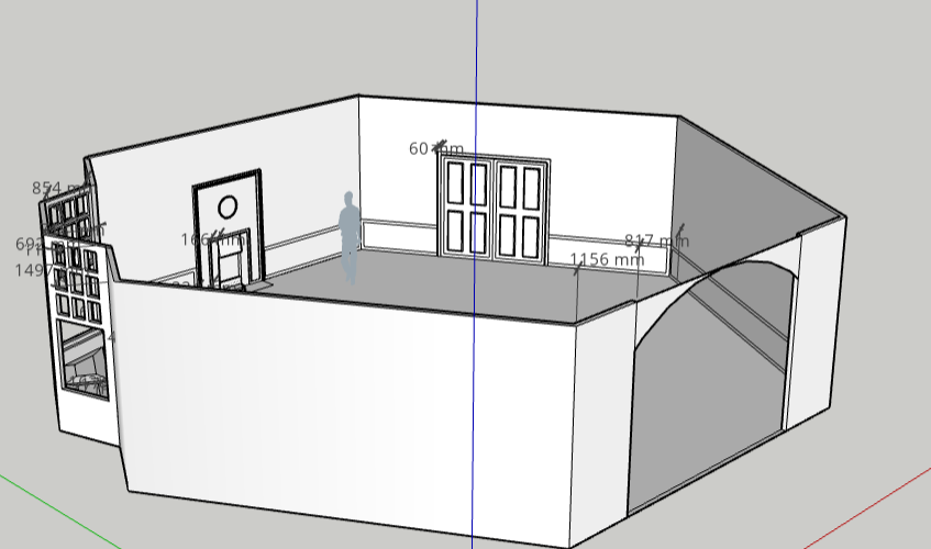
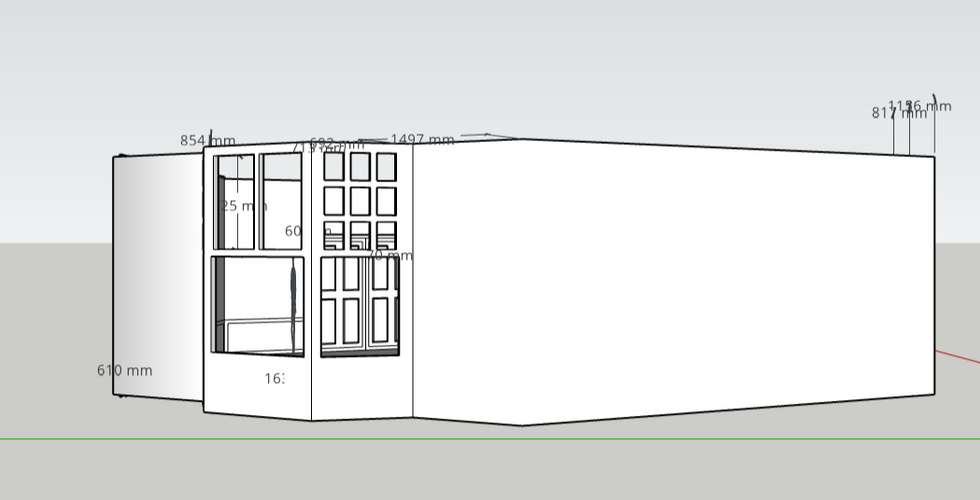
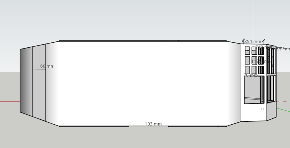
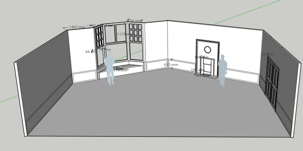
I began by creating a 12mx12m box in sketchup, before inserting a hexagon within it. this way, I know i have leeway in the space I use. I then self-modelled multiple elements (eg. dado, bay window, dining-room doors and a fireplace) as samples in order to show my course tutor the main idea for the room's shape, adding figures into the room for scale:
As I modelled, I used my initial concept sketches (photoshop) as a general reference

Below is the feedback I received from my tutor:
NOTES:
Dado is quite low compared to how it would be in real life - research more into actual sizes for further models (potentially 800-900mm)
Remove some walls so that the stage is splayed out - live studio audience element?
Move furniture to one half of the hexagon + keep only 3 walls
Where would the furniture fit within the space?
Develop the character within the space more
Keep archetypal Edwardian elements whilst experimenting with arts + crafts and nature elements
Developing through feedback
1) From this feedback, I attempted to half the space but did not like the restriction of staging it gave me. I then tried to retain 4 walls whilst leaving room for the audience to see in and preferred this composition (comparison below):
2) I also wanted to fix my dado sizing issue, as though this is only the beginning of the 3D model I want to keep proportions and scale correct.
I discovered a guide, Molding and Trim Styles - Stellar Interior Design, which discussed the style and spacing of the dado, fill and frieze but did not give dimensions.

I then found How High From The Floor Should The Dado Rail Be? | Intrim Mouldings, which had a mathematical formula for ensuring accurate to-scale dado work. This was perfect for me as I had to adjust the heights of my set to account for the lighting rig and camera visibility.
"There are no hard and fast rules to what height you should place your chair rail, but some clever planning can help you create the wall masterpiece of your dreams.
Most commonly chair rail is applied to the lower third of the wall at around the point it looks pleasing to the eye and balances the dimensions of a room."
"The formula we recommend for calculating your dado rail height is:
Wall height (finished floor level to ceiling) DIVIDED BY 5 TIMES 2
You would then apply your chair rail within 100mm of this number."
For my dado, this would be:
3000mm / 5 *2
= 1200mm

Here is the comparison of the dado following my scaling up. I adjusted this height further to fit the composition of the space:

(The fireplace shown is not final).
Once I was happy with the dado size, I extended this throughout the space. I also considered adding a frieze, as I could emphasise further ornamentation, but at this point I have decided to hold this decision.
3) Where would the furniture fit within the space? This is a question I believe can be answered with sample furniture, as I can begin to experiment with compositions.
I used Trimble 3d warehouse assets to explore composition.

This is one example I had in my head. I would replace the singular chair with a tri-seat conversation sofa, popular as a revival piece. This would allow dynamic acting and positioning towards the desk, bay window and doorways if needed.
This space would also be heavily decorated with trinkets, alongside having a statement-piece rug across the floor. Once I have decided upon the suite style I will use I will be able to develop this furniture composition further.
4) Develop the character of the space more. I want to return back to my Pinterest board in order to create a full description of the narrative of the space and its characters.
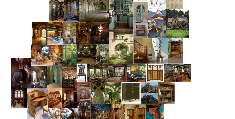
I created mood-boards of the sections of my board:
This allowed me to have a better visualisation of the character that lives within the space. I want to explore a female figure, a rural, working-class girl who has either by inheritence or something similar 'won the lottery' - She is thrust into the high-class city life in london but yearns for the country, hence the Art Nouveau + Arts and Crafts aesthetic. Therefore, her living room would be a space where she would try to recreate the elements of the landscape that make her happiest (also influenced by the City Garden movement).
I am very inspired by the woodland fantasy aesthetic, and want this to be a period-accurate interpretation of some fantasy forest elements. Therefore, in order to keep my aesthetic consistent I need to look towards Edwardian suites with this matching aesthetic within my notes.
In the following posts, I will continue my primary research while developing concept art of all elements of the living room.










Comments