Project 1: 'Period Accurate Graphics'
- ehague1
- Nov 14, 2023
- 2 min read
Goals for the year
As usual, I set out my goals for the year, and for the project:
Improving Vectorworks
Consistent technical drawing.
Twinmotion: increasing my usage.
Improve visuals/concept clarity.
Consistency in work schedule
Expanded research on challenging topics
Chosen topic: 1950's Roller Skates
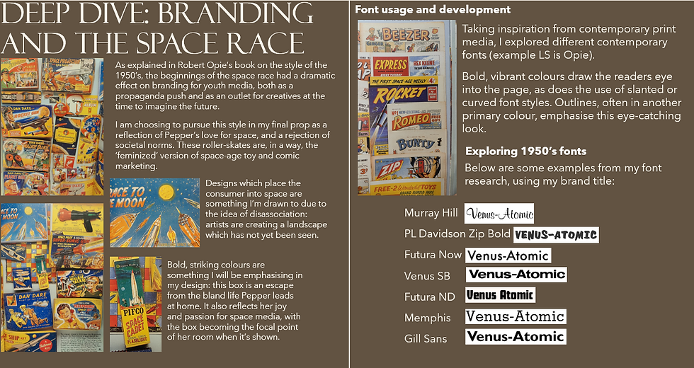
Inspired by the space race and contemporary comic-book art, I wanted to design a space-age 1950's Roller Skates box.
Pepper: Focus character
Research: Roller-skating, 1950's teen culture and the space race.
My research for this project was on an era I had little to no experience with, which is what made it such an exciting challenge for me to work with. For some of my initial research, I visited The Science Museum and Beamish Museum to see their exhibits on the 1950's space race and domestic 1950's life, respectively. For more information, see below.
My research into 1950's teen culture found associations with rebellion and new social niches, allowing me to develop Pepper's perspective on her relationship with her family, and her use of roller-skating as an escape from this.
Design development
I began with moodboards of collections and listings of existing 1950's roller-skate boxes, combined with research further into the comic pop-art style of D.C. and E.C. comics, a prominent example being 'Dan Dare'.
Design Development 1 (initial sketches), loose 'atmospheric' work.
Design development 2 (Class feedback), working to scale, developing designs based on lecturer feedback
Final design work
After creating my final design, I printed this at A1 scale at the NTU Print Shop on matte 200gsm card. Though this meant my final product began to lift at the edges (this can be solved with sturdier glue next time I create a graphic prop), I didn't want to compromise the print quality itself with lightweight paper. In my eyes, this is a better investment when considering filming closeups.
I then spray-mounted this design onto A1 Kraft card, before folding it into the desired shape and creating a box to act at the underside of the faux box. In a real shoot, this would be weighted to simulate the sound and mass of roller skates but would not be opened on camera.
Final visual

Post-presentation feedback
Gill Sans text on the side of the box should not be stretched- a computerized look.
Include company address.
Improve final adhesive quality or change printed card material.
Include stars on the box side
Design otherwise is entirely period accurate and convincing.
Visual needs value development but is otherwise high quality work. Check arm perspective.


Commenti